
Skeptical Scalpel publishes an excellent blog. He recently tackled the topic of whether the public even understands how to interpret surgical complication rates and surgeon report cards. He graciously gave us permission to distribute his post. Read on.
Some data is better than no data at all
Do you believe that?
I heard it frequently when the infamous Propublica Surgeon Scorecard first appeared three years ago. Back then I blogged about it saying “To me, bad data is worse than no data at all.”
A recent study in BJU International confirmed my thoughts about this type of publicly posted data and identified a previously unreported issue. The paper attempted to determine whether the public was able to accurately interpret statistics used in the Surgeon Scorecard. It turns out they were not very good at it.
Investigators from the Department of Urology at the University of Minnesota surveyed 343 people who attended the Minnesota State Fair in 2016. Those who took the survey had a median age of 48, were 60% female, 80% white, and 60% college educated. Their median annual income was $26,550 with an interquartile range of $22,882-$32,587.
The authors showed individuals the figure below on a tablet computer with the accompanying statement “This graph shows the individual surgeons’ complication rates after 28-35 cases. Surgeons A, B and C raw complication rates are A = 1/35 or 2.9%, B = 1/34 or 3.8% and C = 1/28 or 3.6%.”
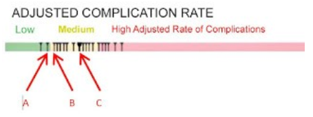
In case you aren’t sure, understand the complication rates for these three surgeons are not significantly different due to the small numbers of cases and complications.
The most surprising finding of the study was although the surgeons’ complication rates were clearly stated above the figure, just 15.2% of the participants could correctly identify surgeon C’s complication rate. The participants thought the average complication rate for surgeon C was 25% (range 3.6% to 50%). Regarding surgeon B, they were better at estimating the complication rate, but still only 34.9% got it right.
The subjects were asked multiple-choice questions related to the surgeons’ complication rates. When asked to choose a surgeon for a hypothetical procedure, 192 (56%) picked surgeon A, 30 (8.7%) picked B, and 19 (5.5%) selected C; 102 (29.7%) said they didn’t have enough information to decide.
Here’s the new wrinkle on the potential harm of misinterpreting data. The subjects were then told that their insurance would only pay if they used surgeon C, and if they wanted to use one of the other surgeons, they would have to pay out of their own pockets. Almost two-thirds said they would pay an average of $5754 in order to have their surgery done by surgeon A or B.
Those willing to switch were significantly poorer, had a significantly higher incidence of a history of cancer, and misinterpreted the complication rates significantly more often.
What this means is that the people who could least afford to switch surgeons were the most likely to do so.
Bottom line: People may misinterpret published data on surgical complication rates which could result in financial harm to them.
What do you think?


I unfortunately find that virtually anything reported in the lay media that is related to the medical field is rife with mischaracterization, oversimplification, or just rank inaccuracy. Often these attributes may arguably have been deliberately introduced to the story to fan the flames of hysteria and thus promote readership.
Not all complications are equal, nor are all preoperative protoplasms. I agree with you that there is no way that attempting to simplify a statistic like this could result in truly informed patient-doctor selection.
1) There is no way to know for certain, but I seriously doubt that 60% of the survey sample was college educated with a median income of $26,000. The median income reported today for all of WV was $43,000 and WV is one of the poorest states. So right off the bat we have problems with the statistics of the people who were surveyed.
2) As far as the analysis is concerned, there is no way to know if the questions were normed, there is no way to know if surveyor bias was involved since these were presumably done live, not by a paper questionnaire.
3) Trying to survey anyone at a state fair is a real challenge, as people are usually trying to get to one venue or event and sitting down for an interview is not likely to get high quality results.
4) All of that said, this result is typical of other results. The lay public has a poor understanding of statistics and what they mean. The stories in the lay press when statistics are reported about anything or even just malpractice cases and the underlying law are often skewed.
5) Has anyone ever sat on a grand jury? The level of understanding that the lay public “jury of one’s peers” has about what is presented in terms of cases and underlying law, is minuscule. The grand jury and juries in general are so biased based on superficial issues that the likelihood of a fair or true outcome is minuscule.
Drag this into the realm of a patient understanding what a good or bad doctor is and it is a complete crapshoot.
A patient may think a great surgeon is one that smiles at them and holds their hand. One surgeon that I used to work with had a heavy accent. When he left the room and I followed him to talk to the patient and family, they would say that they didn’t understand a thing he said, but they trusted him! Fortunately he really was a good surgeon. But can you imagine if he was not?
6) I am all for transparency but the proper context and education must be provided first. Otherwise the public will likely get the information wrong, at which point it is not only not serving the public interest it is actually doing the public harm. That is the exact opposite of what was intended which is after all the law of unintended consequences.
7) BTW where in the constitution does it say that the government will compile and release information on surgeons anyway? The more government intervention we see, the more that we see that they get it wrong.
Each surgeon had a total of one complication. What’s not specified is whether it was early in his experience. But with the lowest possible nonzero numerator, it’s impossible to make a judgment about which surgeon is the best–if one is best–given the number of cases. If one had 1 out of 2, it’s 50%, but that might have been the surgeon who ended up doing the largest number of cases and therefore ended up with the lowest rate over time. It’s obvious that the question were constructed with this in mind.
Questions like this are explored in Dan Kaneman’s excellent book, Thinking Fast, Thinking Slow, and in Michael Lewis’ book talking about Kaneman and Twersky–The Undoing Project. People don’t usually think rationally; they react emotionally to questions posed to them. That’s what’s going on here. That and…
“What this means is that the people who could least afford to switch surgeons were the most likely to do so.”
Why do you suppose that is? It’s because they 1) misperceive him as being the best of the three and 2) that even though they’ll get a bill, they won’t pay it.
I agree with the above comments about likely college-educated people having low incomes. Something’s not quite right in Denmark about these data. For example, was “not enough information to tell” an option in choosing the surgeon? That’s not discussed above.
This survey does not mention any specific procedure, just number of procedures. Complications are more common with complicated patients and their surgeries. I believe this data unfairly discriminates against those who take on the most challenging cases.